Quick question: would you read a blog post that looks like a giant block of text?
If your answer is yes, then that’s amazing, congratulations! But, if you are just like the rest of us and technical writing is not your specialty, you probably get bored pretty quickly when a blog post has nothing but text.
It’s not your fault that text turns you off – the human brain is wired to process visual content 60,000 times faster than text. According to scientists, only 10% of people remember things that they have heard and around 20% of them remember things they have read. On the other hand, 80% of people remember the things they see and do.
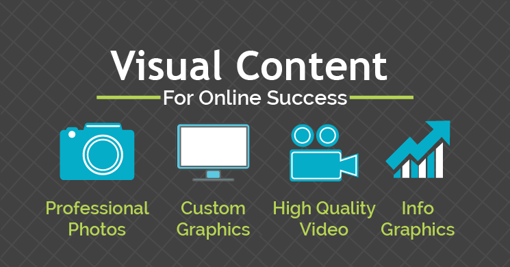
Image Source : maneuverup dot com
Since our brains are wired to love visual information, it should come as no surprise that blog posts that include imagery get up to 94% more views.
It’s clear that images play a huge role in boosting page views, generating more backlinks, and driving engagement. But, if like me, your graphic design skills are limited to cropping and resizing pictures, then creating engaging images can turn out to be quite difficult.
But, worry not, there are a few tricks even technically challenged content writers like me can use to create amazing visual content for their blog posts.
-
Pay Attention to the Principle of Visual Hierarchy
Try to picture seven circles of different sizes. Some are bigger than others, some have different colors, some are in the foreground while others are in the background. Would you be able to rank the circles in the order of importance based on the information given?
Of course, you would.
Without any additional information about the circles, you would have no trouble ranking them. That’s visual hierarchy.
The idea is pretty simple: some elements of your images are more important than others. If you want people to notice them, you need to make them stand out. For instance, you need to focus on things like position, contrast, color, size, and so on.
Which brings me to…
-
R.A.P. – the Four Principles of Design
Good design is based on four essential principles: Contrast, Repetition, Alignment, and Proximity. So, when a graphic designer tells you that your visual content is C.R.A.P, that’s actually a compliment.
Here’s a brief overview of these principles:
- Contrast
The idea behind contrast is to make important elements stand out. A big, bold call to action on a white background will stand out in a big way. Contrast is especially useful for skimmers who like to scan articles. A good use of the contrast principle will let readers know where to look first, second, and third on your images.
- Repetition
Repeat visual elements, like fonts, colors, size, like thickness, etc. to make your images cohesive across your article.
- Alignment
Proper alignment of the elements in your visual content creates a clean and balanced layout. For instance, make sure both the top and the bottom of your image are aligned with the text inserted.
- Proximity
Proximity means that different elements of an image are associated with one another (or not) so that they can guide viewers to certain parts of the message. Applying the proximity principle means that your viewers should notice the image first then the text, helping them better understand the message.
-
Color Can Change Everything
The color is not just a design element. The psychological effects of colors have been studied by scientists for hundreds of years, and the impact they have on human emotions is very real. Each color evokes a different emotion, and that affects the way people interact with your images. For instance, red is a dominating color that can add passion and aggression to your visual content, increasing awareness. Blue, on the other hand, is the color of calm, and it’s often used by banks because it inspires trust and safety.
You must also pay close attention to contrast because the meaning of an image can change dramatically based on how you combine colors. A great tool that helps me a lot is Paletton – it chooses contrasting and complimentary colors automatically so that you don’t have to worry about it.
-
Choose Fonts Wisely
Choosing a font is like picking which clothes to wear. Your choice evokes your style and personality, and it will impact how others relate to you. Going to a meeting wearing a suit versus wearing jeans and a t-shirt will leave people with different impressions about you.
Likewise, when you use fonts in your blog posts’ images, they convey an important message about you.
When you select fonts for your images, make sure they are easy to read and compliment the image. Also, try to be consistent and use the same font for all images within a blog post.
Most content writers are great at painting pictures with their words but have troubles when it comes to painting pictures with Photoshop. But, that doesn’t mean they can’t use some designers tricks to create stunning visual content for their articles.
You can also stay updated by subscribing to iTechCode.