Excel charting is often not used to its full potential. In most the cases, simple bar and column charts are created to show data points.
However, the charts in Excel can be extremely useful in showing complex data points and comparisons.
Since charts are visual and make it easy to understand and interpret data, it’s a useful skill to have for data analysts. This becomes especially useful if you required creating reports or dashboards for the management or the clients. Charts make it easy to interpret data and get insights out of it. Using charts also allow you to highlight specific data points that need to be discussed or are the areas of concern.
Here are five chart types that can be useful when trying to present complex data visually.
Histogram Chart
A histogram is a chart that shows the frequency of data points in a specified range.
For example, if you have sale records of a retail store, you can plot a histogram to see the number of sales happening by the hour.
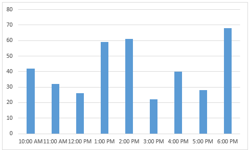
This will help you understand which hours of the day are busy and you can plan accordingly. You can easily create a histogram in Excel using the data analysis tool pack or the frequency function.
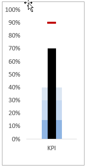
Bullet Chart
Bullet chart was conceptualized by dashboard expert Stephen Few to show more data in less space.
A bullet chart allows you to measure the performance against a target value. It also shows ranges which help in identifying a category in which the data point lies.
For example, if you’re plotting a student score, you can see whether the student achieved the target of 35 to pass or not. At the same time, you can also categorize the score as poor, satisfactory, and good by creating colored bands.
Waterfall Chart
Waterfall charts are quite common in cases where you need to analyze the breakup of a data point.
For example, if you have the overall cost of a project, then you can break it down and create a waterfall chart.
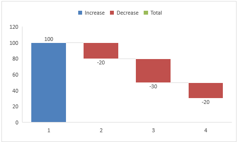
The chart can show difference components such as resource cost, tools cost, material cost, miscellaneous cost, etc.
Actual Vs Target Charts
This type of chart is often useful during sales/management meetings. It allows you to analyze how the performance has been as compared with the set targets.
For example, if you have a sales target for various divisions of your organization, you can create an actual vs target chart to show if the target is met or not, and if not, then how much is the gap.
Scatter Charts
Scatter charts are useful when you want to compare many data points against 2 parameters.
For example, suppose you are looking for investment opportunities and you want to invest in companies that are growing at a rate of 50% and have positive cash flows.
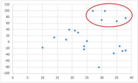
You can do that by plotting the data for all the companies on a scatter chart. Once plotted, you can visually see all the companies that lie in the top right part of the chart.
These are five charts that are commonly used and can easily be created in Excel. There are many more chart types (such as box plot, Pareto chart, and step chart) that you can use based on your data type and your audience.
You can also stay updated by subscribing to iTechCode.